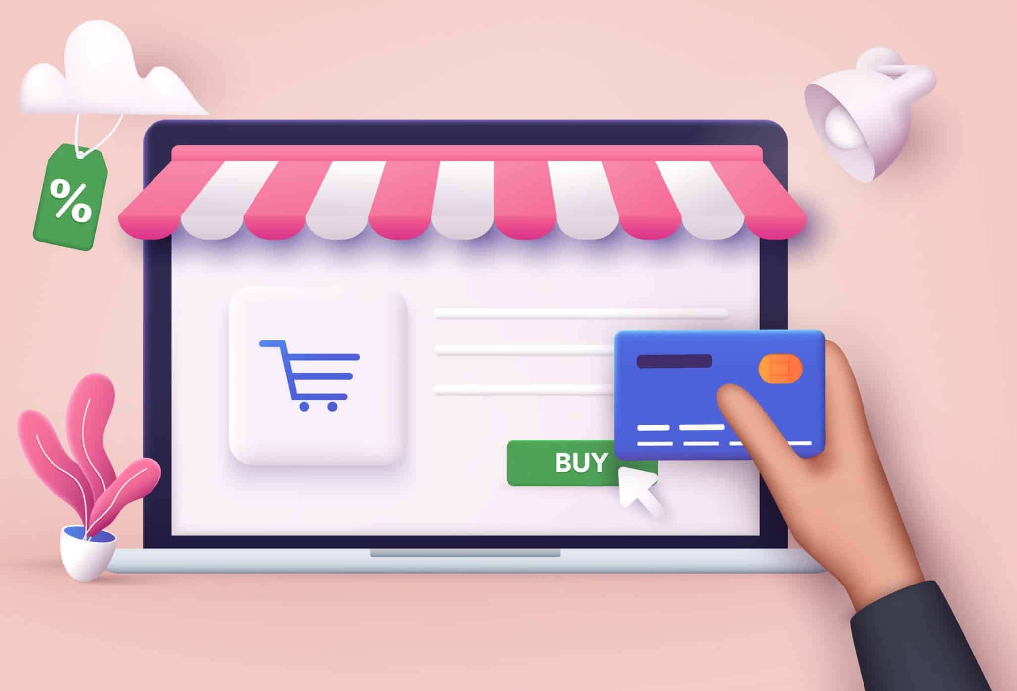
If you want the best checkout page design that gives your customers the greatest checkout experience but also allows you to make more money then this article is for you.
In this article, I will take you through the best checkout experiences. This is so you can understand which is the best checkout page design for your business. I’m going to share a couple of checkout types. I will explain which one you need to choose based on what kind of business you are running.
What I’ll be explaining to you has been highly researched by the Dashnex team. You’ll understand how that very same research impacted our own decision to build one particular checkout over another. It will also help you decide which one you should choose for your business.
I’m also going to take you behind the scenes of that research. We dived into big brand checkouts from the likes of Apple, Nike, and Adidas. This was so we could understand which ones perform better. And how that all plays a role when it comes to higher conversions and making more money for your business.
And finally, I’m going to show you two checkout experiences designed specifically for desktop and mobile. You’ll see how the crucial differences are vitally important if you want your store to generate more sales.
The Two Types Of Online Store Checkouts
When it comes to the best checkout experiences, there are two types of checkouts that people use. One is the two-step checkout, and the other is a single-page checkout.
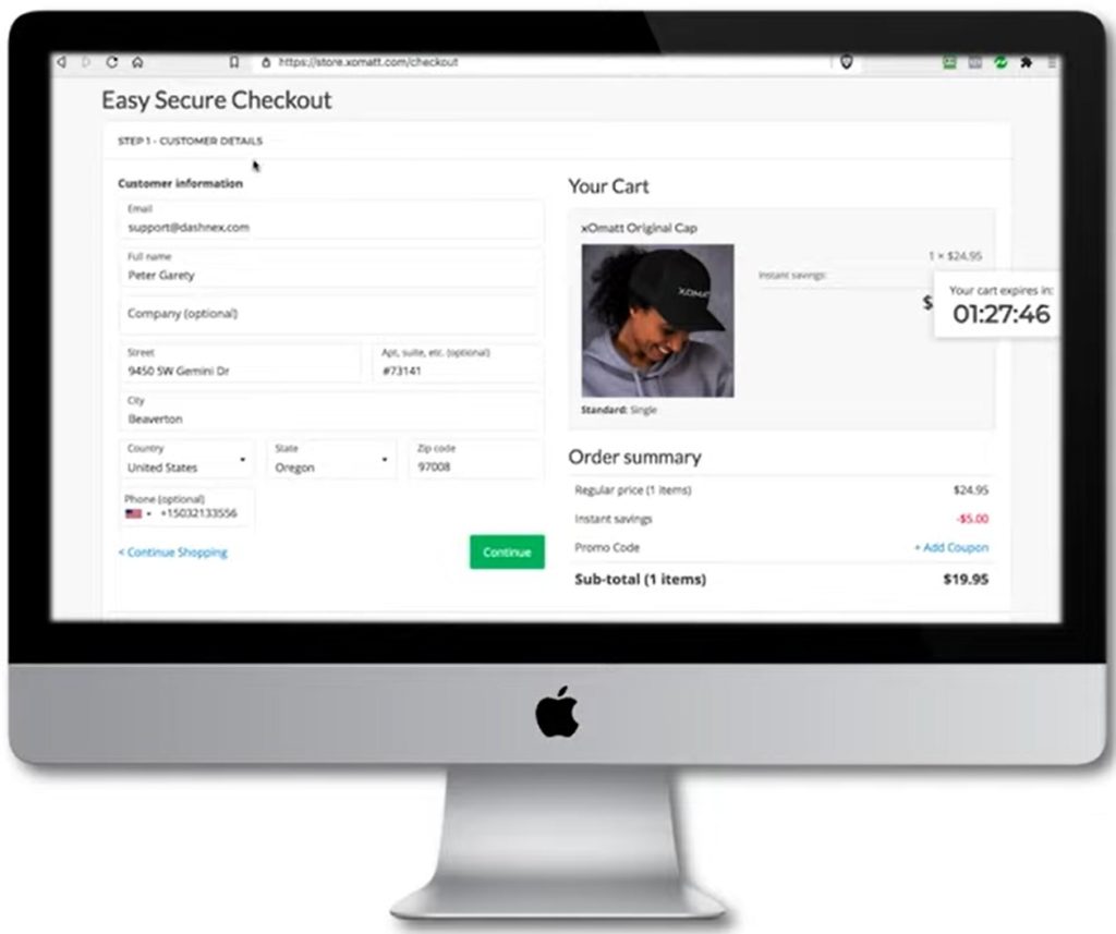
With a two step checkout, the first step involves your customer entering information on the first page, as you can see here:
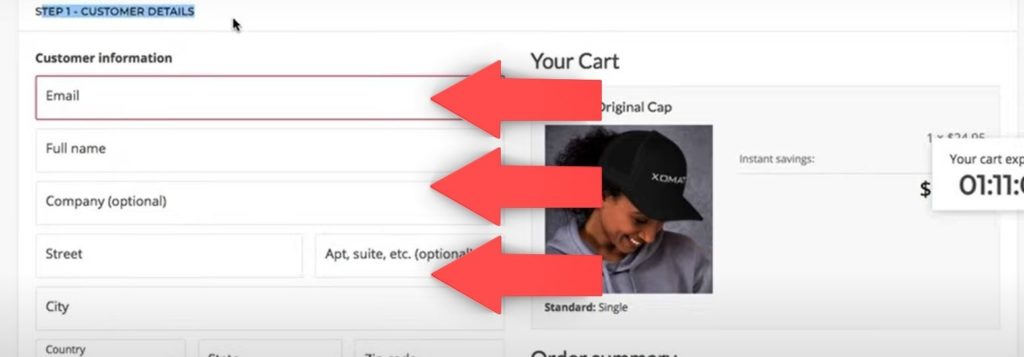
They need to fill in the required information in this step before moving on to the second page. This page contains more choices before they complete the checkout.
In comparison, with a single page checkout the customer enters all of their details on that one page. Then checks out right from that single page, as can be seen below:

At a glance, it may seem that a single-page checkout design will always give the best checkout experience. But as an online business owner, it’s essential that you stop and think about your checkout and how it relates to your business. Then, it would be best if you found a compromise between the user experience and your conversions.
Ultimately you want the customer to have a great experience. But you also want to use the checkout that makes the most money for your business.
Which Online Checkout Page Design Should You Choose For Your Online Business?
You may be wondering which one of these two checkout page designs is best for your online business.
Let’s compare the two checkout page designs in more detail. I’ll explain which should be used depending on your business model.
Single Page Checkout
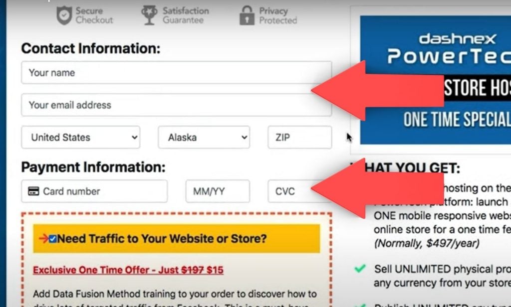
Single page checkout page designs are best used for information/digital products. For these products, you don’t need to add any variables such as shipping information or any additional calculations. Hence, a single page online store checkout keeps the customer on the page right through to the end of the checkout. It’s also highly effective to include a list of all the product inclusions and testimonials from current customers as these improve conversions.
Here’s an example of a one-step checkout showing what’s included in the purchase:
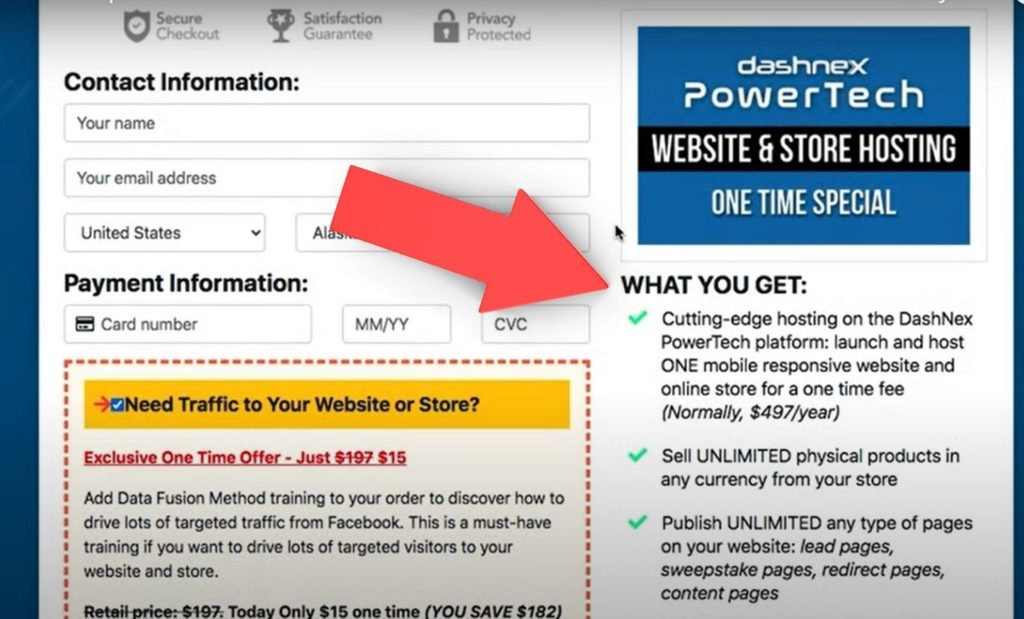
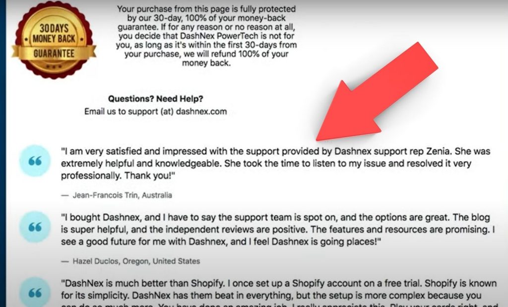
And further down the one-step checkout page design is the section with testimonials from happy customers:
As you can see, you only need to ask your customer for basic information such as their name and email address This is why we prefer to use a single page checkout for products such as information/digital products:
Two-Step Checkout
When it comes to eCommerce, physical products, or services, it’s the opposite as you need more information from your customers. So for these business models, we prefer the two-step checkout.
The first step is to capture the customer information like name and email address. It’s also recommended to ask for their physical address & telephone number here too. Then, if they stop checking out, you can follow up with them to see why. Then help them finish this best eCommerce checkout process.

In the second step, you want to ask for shipping information. This is so you can provide more shipping options for the customer. In addition, this allows you to calculate the cost of the product and shipping so the customer can see the total cost.
So with an eCommerce store or selling services with more variables, a two-step checkout page design is a better solution than a single page checkout.
What Online Checkouts Are Working Best Right Now
When we decided to design the checkout for the DashNex PowerTech platform, we wanted to fully understand what works and what doesn’t right now to get the best results for our users. We didn’t want to go out and look at some random online stores and then design ours based on that. We also decided that we wanted to design our checkout from the ground up.
So we went to the Baymard Institute, based in Denmark. They’ve completed enormous eCommerce design studies across thousands of different websites, including some of the world’s biggest brands. They provide a benchmark reference for any eCommerce checkout designer to understand what is working right now.
So we purchased their mobile eCommerce checkout page design study. It contains around 400 pages of in-depth study of different elements of an eCommerce store. This included online shopping carts and checkouts. We got to work on analyzing the best checkout page designs. So that we could adopt what’s working for some of the biggest brands in the world.
Take a look at just a few of the brands in the study:
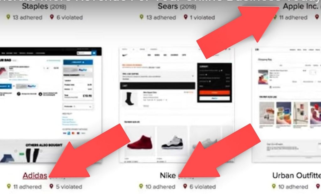
You can see that they have studied brands like Apple, Sears, Staples, Adidas, Nike, Urban Outfitters, and thousands of other top-level brands in the world.
After studying this 400-page report and looking at all the small details and user experiences, we understood what those top-level brands are doing to provide the best eCommerce checkout experience. But there was one major thing which we still needed to decide. Should we build a dedicated mobile checkout, or do we do what everybody else is doing and create a so-called responsive checkout?
Separate Online Checkout Experiences or Responsive Checkout Experience?
If you think about where the world is going right now. If you look at mobile trends. The traffic from mobile devices and the e-commerce growth on mobile devices are absolutely staggering. When you think about it from that perspective, you realize that you can’t just build a responsive checkout experience. Instead, you need to build different checkout experiences, one for desktop and one for mobile devices.
Let’s look at the same product on the same eCommerce store that has built two separate checkout experiences on the Dashnex PowerTech platform, so you can see how they compare. I’ll also show you some of the small details that we picked up from the Baynard Institute study that you could also implement right away.
This eCommerce store has used a two-step checkout experience to increase conversions.
A Desktop Checkout Page Design
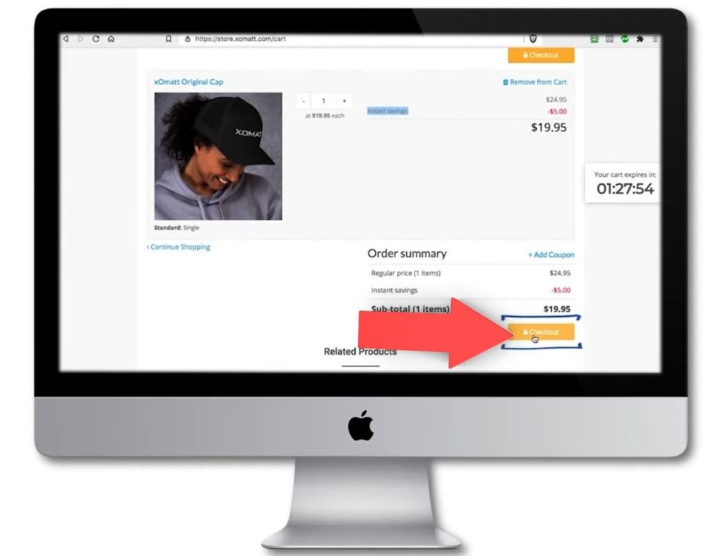
Here we are on the product page. We select the single option and click ‘add to cart’ to reach the desktop version of the cart.
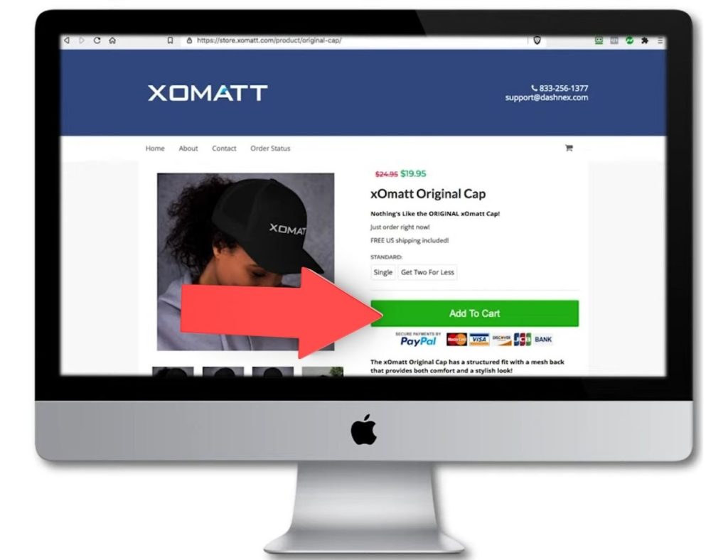
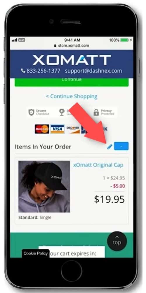
Baynard Institute Study Hot Tip: Using an element like ‘Instant Savings’ on the cart page will increase your conversions as it’s been proven to result in more sales for the business.
From here, customers can click checkout to start the checkout process.
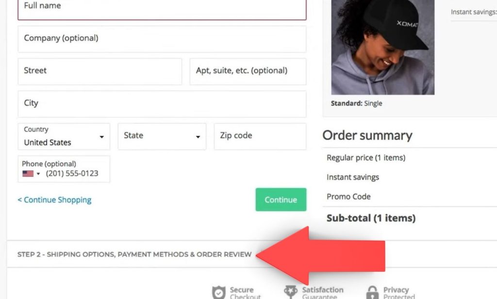
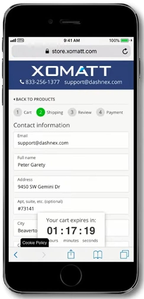
Because this is the first step of the two-step checkout, this store has asked the customer to give their email, name, address & phone number. As a store owner, you can decide what information to gather from your customer on the first page.
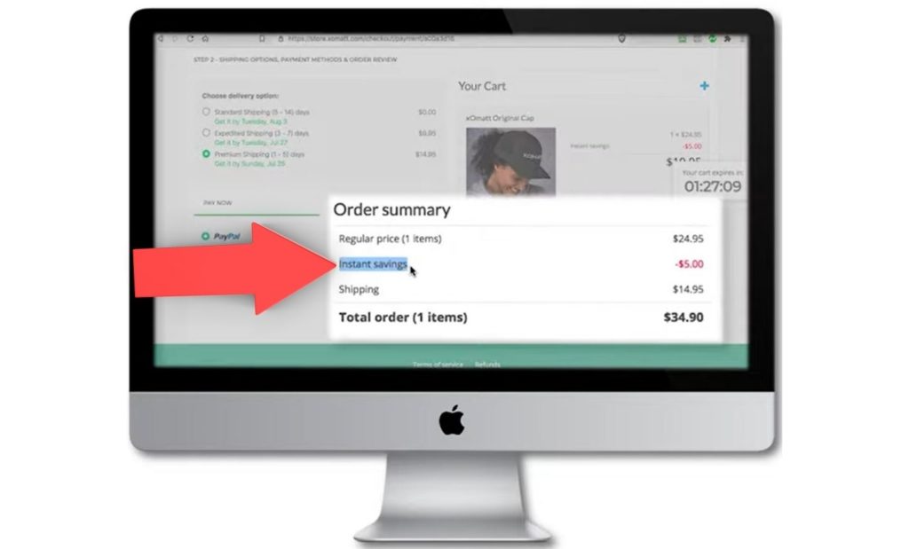
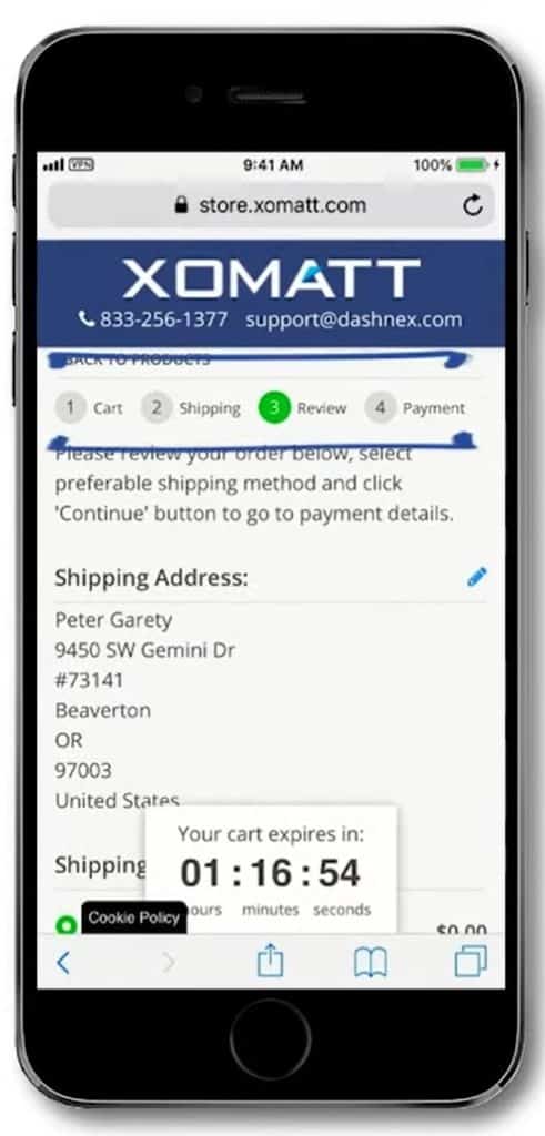
Once your customer has done this, they can click continue to the second step. This is where they can select the shipping options and look at the payment options.
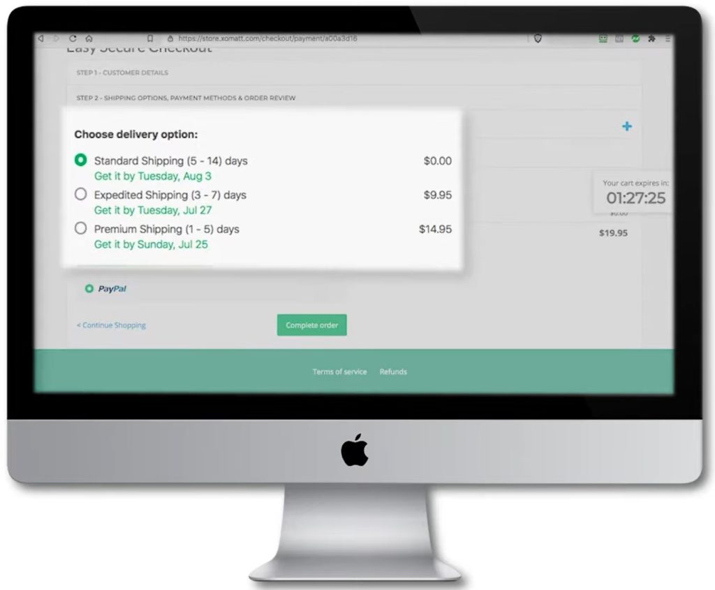
As you can see, the customer can select whichever shipping option they want and then review the order to make sure everything is as they want it. Once again, the ‘Instant Savings’ is displayed on this second step, which will result in you making more money as a store owner.
If your customer completes the order, you have the sale as a store owner, the customer has ordered what they want, and everybody is happy. If they don’t complete the purchase, the two-step checkout has been used, so the information is captured in the cart and checkout system. This allows an automatic follow-up to take place. You can simply say, “Hey, you forgot a product in the cart, come back. Please complete the checkout.” You can even design custom campaigns around that to make sure that you close more people through the follow-up. That’s why the two-step checkout is so important for an e-commerce store.
A Mobile Checkout Page Design
Now let’s take a look at the same store & same checkout on a mobile device.
As you can see right away, it looks very different.
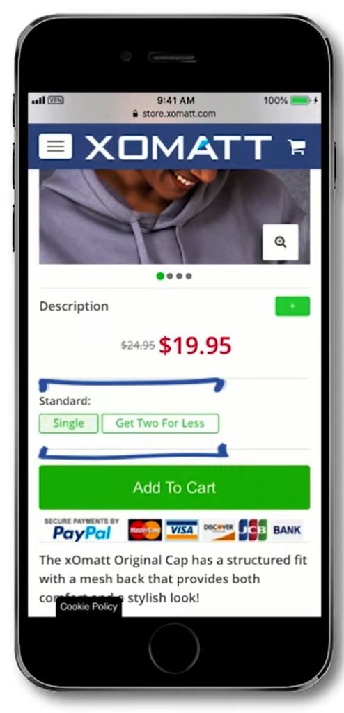
Once again, you select a single option, click to add the product to the cart:
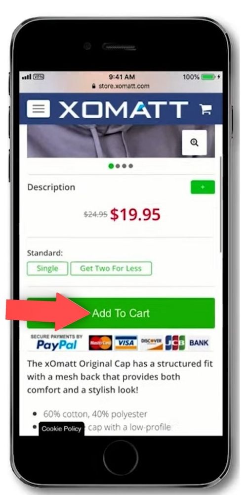
You’ll see the cart looks very different from the desktop version.
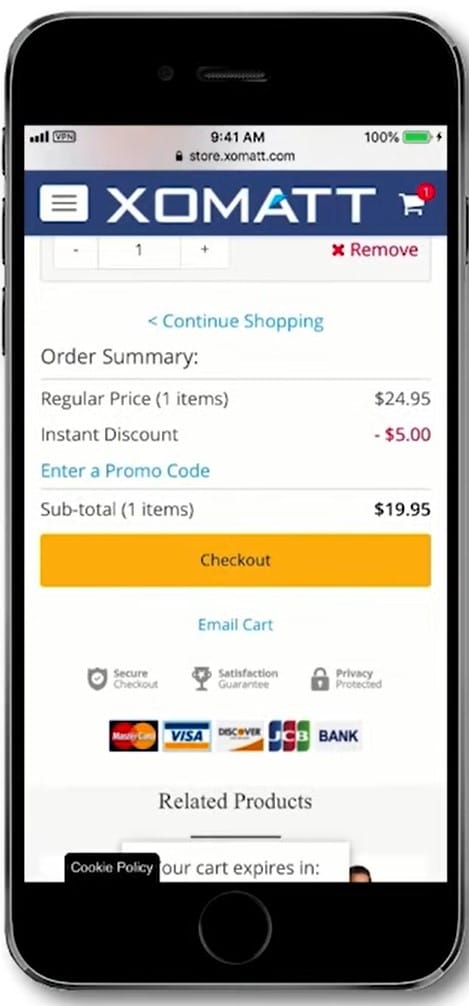
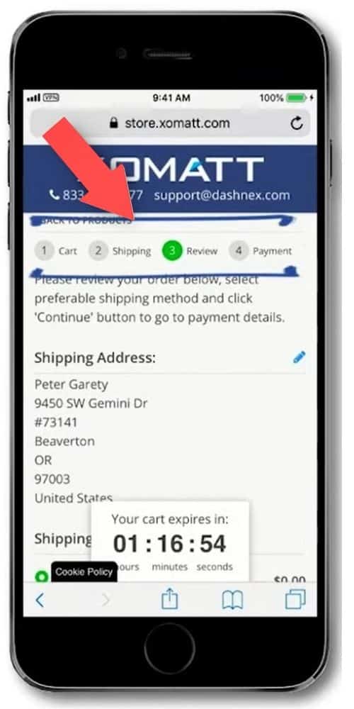
Baynard Institute Study Hot Tip: You can see in the image below that on the mobile experience, there are steps at the top for cart, shipping, review & payments. Having these steps will increase your conversions. In addition, your customer will know in advance the steps they need to go through during the checkout process. This results in less cart abandonment.
As you can see below, your customer can also email the cart to themselves. This ’email cart’ link below the checkout button allows the customer to finish the checkout on a desktop if they prefer:
Once the customer is ready, they click the checkout button to move to the first step of the checkout, where they provide information such as email address, name, address, and phone number.
The customer then continues with the checkout by moving to the next step of the process. Once again you can see that the customer knows precisely which step they are on at that time.
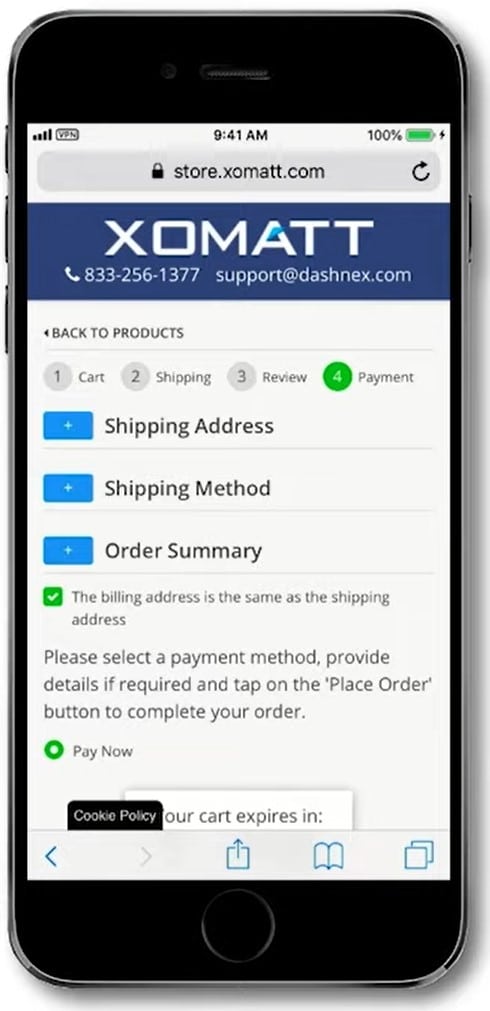
Baynard Institute Study Hot Tips: Allow your customer to edit and review their purchase in case they see a mistake. This is important to provide on a mobile checkout experience. This will also reduce cart and checkout abandonment. In addition, they should be able to edit the shipping address and review their cart items displayed.
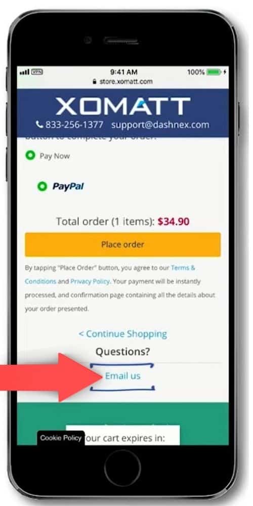
Once customers click to the payment option, they will be able to see everything. They can see the shipping address, the shipping method, and the order summary. They can select a different billing address if they want to. And they can select the payment option based on what you as a store owner have configured.
Once again, if you look at the bottom, there is email as an option, which is important for those wanting to move across to desktop to complete the checkout.
It’s essential to help people in every single step to complete the purchase on a mobile device.
If there is something they need to change, it should be easy for them to go back to make the updates.
Another important aspect is to ensure that you have the cart items displayed at the bottom of the screen because this has been proven to be the best to maximize conversions.
So this is how we have designed the checkout experience on Dashnex. One for desktop and one for mobile, and both are automatically working simultaneously on the store.
What’s more, the store is detecting whether a customer is on a desktop or mobile device, and based on that, they can get the best experience for their device. If you’re considering diving into eCommerce for your business then take a look at our article on what eCommerce platform is best for small business.
Choose The Best Checkout Experience For Your Business
After reading this article you now know the difference between a one-step and a two-step checkout. You should understand why you should design one specifically for desktop and one for mobile. What elements you need to consider when you build your checkout experience for the best user experience and maximum conversions.
Here at DashNex, we are all about helping people achieve results without wasting time on complicated setups or configurations or wasting time and money on stuff that doesn’t matter.
So if you choose DashNex PowerTech as your solution, all these critical features are already built-in, so you don’t have to do anything.
You just click a couple of buttons to enable your checkout. All of these features will be working for you straight out of the box.
As you can see from everything, I’ve discussed in this article, choosing the best checkout page design for your particular business is incredibly important. In addition, we’ve made a video on the subject of the Best Checkout Experiences To Generate More Revenue For Your Online Business Today, so please feel free to watch the video below this article.